Viewports
Manual
Viewport
with controls
There are two kinds of viewports:
- viewports without any controls, and
- one viewport with controls, showing the show's progress, with a background-menu, etc.
viewport options
control options
phase options
examples
How to create a viewport with controls
For this, you should read how to create viewports, and the examples below. A typical example of a control viewport look like: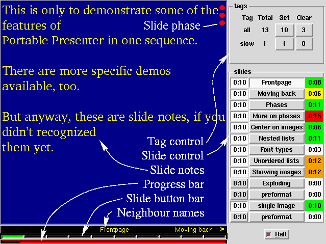
- a background menu,
- control popup (optional),
- tag control (unless control-popup),
- slide control (unless control-popup),
- slide phase,
- slide notes,
- progress bar,
- slide button bar, and
- neighbour names bar.
Options for control viewports
Viewports with control have all options of the usual viewports, but often with other defaults, but have a few more which are used for the various controls which are displayed:-
- -includeControls => boolean
- This flag determines wheter the
slide-control and
tag-control should
be included in the control-window or via a popup.
The default is in a seperate popup, but the implicit generated control viewport will contain these controls. - -showPhases => boolean
- Specifies if you want to see how many phases still has to be done
to complete this slide. Read the special page about the possibilities
on location and shape of the representation of
phases.
- -showProgressBar => boolean
- -showSlideButtons => boolean
- -showNeighbours => boolean
- -showSlideButtons => boolean
- By default, the control viewport shows these bars, but you can
turn them off using the background-menu or by setting these flags.
- -progressColors => [ color, percent, ..., color ]
- When time tics away, the required time for a slide, or the available
time for the show is running out. With colors this is expressed. You
will find the same colors in the progress-bar and in the slide-timings
of the slide-control window.
The default is:
[ qw/white 0.5 yellow 0.7 green 0.9 orange 1.1 red/ ]
which means: white until 50% of the time is consumed, then yellow till 70%, then green till 90%, oranje till 20% too much time spent, and after that it turns to red. With this option you can change this. - -progressLineWidth => pixels
- The thickness of the line which is shown in the progress-bar. The
height of the bar is a little wider than twice this thickness.
- -progressBackground => color
- Color of the background of all the control-bars.
- -slideButtonBackground => color
- Color of button representing the selected slide.
Defaults to
'green'. - -neighbourNameColor => color
- Color or names shown: the previous, current, and next slide.
- -neighbourNameSize => pixel-size
- Size in which the names of the previous, current, and next slide
is printed. The size should be in pixels (default is
'10p', because on the time this bar is created, there is no style (hence no fontset) defined. Sorry.
Examples
You can create a control viewport implicit:
   use PPresenter;
   my $show = PPresenter->new
       (-controlDisplay => 'xterm:0');
which is equivalent to the explicit:
   use PPresenter;
   my $show = PPresenter->new;
   $show->addViewport
     ( -name            => 'control'
     , -display         => 'xterm:0'
     , -geometry        => '640x480'
     , -hasControl      => 1
     , -includeControls => 1
     , -style           => 'slidenotes'
     , -showSlideNotes  => 1
     );
In both cases, a viewport for slides is automatically added.
Portable Presenter is written and maintained by Mark Overmeer. Copyright (C) 2000-2002, Free Software Foundation FSF.